In Part 2 of her how-to on digital advertising, RWS’s Jennie Gilbert describes the do’s and don’ts of landing page design.
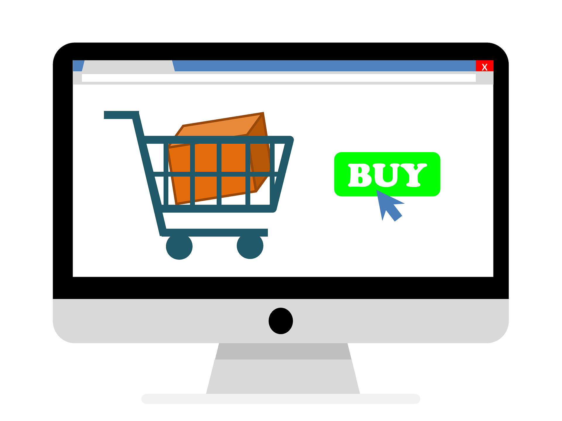
We often hear “It’s not the destination, it’s the journey.” But the opposite is true in today’s dizzying digital age of impressions, visits, conversions and clicks — especially when it comes to digital advertising and online shoppers.
When we measure the effectiveness of consumer interactions with online ads, metrics of success are tied to the “destination,” or landing page, associated with an ad. When an online ad displays in front of a consumer, one click is all it should take to get to the landing page that, by design, makes or breaks the success of any digital ad campaign.
Above all, these destination pages should be highly engaging and user friendly, easy to understand, and optimized to adapt and look good across tablets, smartphones or whatever device someone’s using.
See: Mobile Commerce: One Size Doesn’t Fit All
All too often, consumers click on online ads that lead to poorly designed landing pages. The top three things that cause frustration among online consumers: 1) no clear path to purchase the product, e.g., a link to a rebate PDF with no link to shop for the applicable products; 2) outdated materials/information or expired content; and 3) an unorganized “sea” of scrolling products displayed all at once.
In any given week, the Retailer Web Services (RWS) promotions team designs hundreds of specific, optimized landing pages associated with digital advertising campaigns for participating appliance, electronics, furniture and mattress retailers. Through automation software, the pages are dynamically customized to include the retailer’s branding; feature the relevant products that are in the promotion and on the retailer’s site; and include all the right links that lead to additional pages within the retailer’s website, where consumers can continue their purchase journey.
From our team to yours, here are seven best practices for optimal landing page design — and your digital ad campaign success:
1. Design with mobile in mind.
Large desktop images need a mobile-friendly version that eliminates unnecessary space and provides the main message along with a few other key pieces of content. The product layout requirements for a small screen are much different when viewing from a large screen. While large screens can display products in multiple rows and columns, mobile screens should display product rows using a horizontal scroll. This allows the products to be easily scanned while the vertical scroll stays static, which keeps the user’s place on the page.
2. Use a compelling “hero image.”
Also known as the banner image at the top of the page, this is the first thing the user sees when the landing page loads. It should capture the main idea of the page, depicting the offer. Use images that show human engagement, where the offer meets lifestyle.
3. Get straight to the point.
Use clear and concise language that conveys the savings. From the user’s perspective, the savings is the message they expect to see after clicking on the ad. Keep it simple. There should be no second guessing on the part of the potential customer.
4. Show the products, but reduce the scroll.
Great landing pages don’t show row upon row — and scroll upon scroll — of products. Rule of thumb is no more than four or five rows. This can be tricky when you’ve got dozens of models of appliances or mattresses. One way to get around this is to show one dishwasher or mattress, for example, with a link to all models.
5. Categorize products.
Showing products in a categorized fashion is what separates a good landing page from a great one. It’s important to establish a categorical hierarchy that begins on the landing page and “drills down” to appropriate product pages on the website. The goal of categorizing products on the landing page is to not overwhelm consumers, and to provide a user-friendly experience for them to browse.
6. Have a clear call to action.
What do you want the consumer to do? Shop now? Call or visit the store? Find out more about the savings? This should be straightforward with available, prominent links (such as a one-button click), pointing to their respective pages without broken links, which is a common pet peeve among online shoppers.
7. Include “Call us.”
This seems like a simple element, but not all landing pages get this right. The optimal ones include a “Call us” link with the direct phone number to the retailer. This is particularly useful — and should automatically appear — when a retailer doesn’t have a product in stock.
Clearly there are many elements that go into the creation of a top-notch landing page to yield online ad results. Be sure to work with experts in digital design to ensure your next landing page is a destination worth visiting.